Contents
Lambert's black halfLight that gives the shade back its shape and colourWhere light is blocked, it gets dark againChoosing colours that survive in the shadeTurn them on and off yourselfReferencesThis post starts from the same scene again: the block diorama I built for this series, running on a renderer I wrote myself in WebGL2.
A small floating block island rendered with WebGL2: a cottage, a pond, three trees, flowers and one big-headed villager. Block edges are shaded round, shadows are tinted blue-violet, each block gets a candy-like pattern and a soft glaze, and the top and bottom of the frame are blurred so it reads as a tabletop miniature. Drag or use the arrow keys to turn the island.
Look at the shaded sides of the blocks, the shadow under the tree, the concave corners where one block meets another: nothing is pitch black. The shade is a little darker and a little bluer, but it is still grass green and still earth brown. Write your first shader, though, and you get the opposite. Put one sun in the sky, compute the lighting by the textbook, and every face turned away from the sun is painted black. This post is about where that black comes from, and how games get rid of it.
First, a short reminder of this series' premise. I could not find any official technical material on how ぽこ あ ポケモン (Pokémon Pokopia) is rendered. All that has been published are remarks about its art direction. So I take those remarks as clues and draw my own block diorama, not the original game, with my own renderer. Everything implemented below is my interpretation; none of it means the game was actually built this way. Shapes and rounded edges were covered in the previous post, Why square blocks look soft.
This time the clue is 'チル&ポップ' (chill & pop), the keyword Koei Tecmo's art director Marina Ayano (綾野万里奈) mentions in a Famitsu developer interview. It was a shared keyword that the art director and the sound director settled on together early in development.
ゆったりまったりとしたチルの要素とかわいらしくて親しみやすいポップな要素の組み合わせで、各アセット制作に臨みました。
In other words, they made the assets by mixing a relaxed, unhurried 'chill' with a cute, friendly 'pop'. To me, the least 'chill' thing on a screen is a pitch-black shadow. Pure black makes the strongest contrast in a frame, and it wipes out the colour of whatever is there.
Here is the answer up front. In the real world, shade only hides the sun; it still receives sky light and light bounced off the ground. Games fake that light cheaply, and they choose the colours themselves so that colour remains in the shade.
Lambert's black half
The most basic diffuse light is the Lambert model. The brightness is the dot product of the surface normal n and the direction towards the sun l. With the sun straight ahead it is 1, at a slant it is less, and parallel to the surface it is 0.
The trouble is the max(0, ·). For a face turned away from the sun the dot product is negative, and since there is no such thing as negative light, it is clamped to 0. Light a sphere with a single sun and exactly half of it is 0. On a block, every side and bottom face turned away from the sun is 0. Without any other light, those faces turn black whatever their base colour.
It is a multiplication, after all. Any grass green times 0 is (0, 0, 0). The shape goes with it. Inside the region clamped to 0, faces pointing in slightly different directions all get the same 0, so the shaded half looks like a flat cut-out with only its outline left. Step 1 of the lab at the end is exactly this state. With ambient set to 0 and only Lambert on, 16.8% of the island's pixels were under 3 out of 100 in screen brightness: black, for all practical purposes.
So nearly every game renderer adds something here. The oldest trick is constant ambient, which adds the same amount of light everywhere. The black goes away, but the whole shaded side lifts to the same greyish tone, and the missing shape is still missing.
Light that gives the shade back its shape and colour
The first fix is to change how the dot product gets clamped. In their SIGGRAPH 2006 course notes Shading in Valve's Source Engine, Valve describe Half Lambert like this: scale Lambert's dot product by ½, add ½ and square the result, so that a value that ran from -1 to 1 now runs from 0 to 1.
Now only the single point facing directly away from the sun is 0, and everything else is at least a little bright. Even on the shaded side the brightness keeps changing with the direction of the face, so the shape survives.
Wrap lighting turns a similar idea into something you control with one parameter. In chapter 16 of GPU Gems, NVIDIA's Simon Green introduces this formula as one way to fake subsurface scattering in skin.
With w at 0 it is plain Lambert; the larger it gets, the further the light wraps around to the back of the object. Green explains that this reduces the contrast of the diffuse lighting, which decreases the amount of ambient and fill lighting that is required. Less contrast in the diffuse light means less ambient has to be filled in separately.
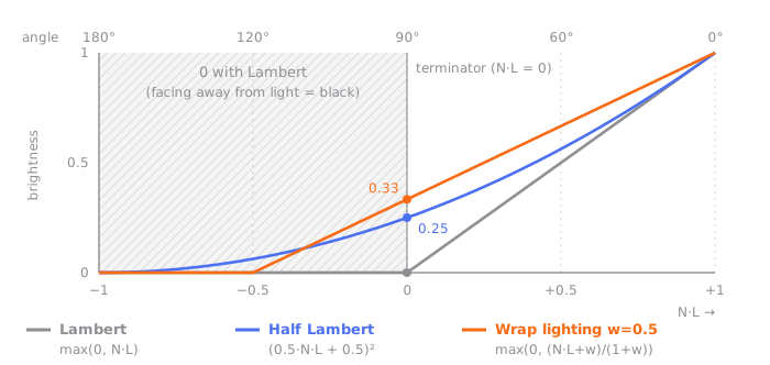
The wrap lighting in the graph is drawn with w = 0.5 so its shape is easy to see. My renderer uses w = 0.25. At that value, faces with N·L below -0.25, the ones clearly turned away from the sun, are still 0; only faces near the terminator get lifted.
Here is simplified GLSL for the sake of explanation. The lab's diffuse option (Half Lambert or wrap) picks one of them.
float lambert(vec3 n, vec3 l) {
  return max(dot(n, l), 0.0);
}

float halfLambert(vec3 n, vec3 l) {
  float h = dot(n, l) * 0.5 + 0.5;
  return h * h;
}

float wrapDiffuse(vec3 n, vec3 l, float w) { // my renderer uses w = 0.25
  return max((dot(n, l) + w) / (1.0 + w), 0.0);
}
The cost is practically nothing: a multiply and an add or two. On the other hand, these formulas are far from physics. Sunlight can't really reach a face turned away from the sun; we are pretending it does. And this light is still the colour of the sun. The shade gets brighter, but it only becomes a yellowish shade lit weakly by yellow sunlight; the blue of the sky never gets in. So my renderer keeps the wrap small and leaves the colour of the shade to the ambient.
That is also why the lab's default time of day is 0.45 (a little before noon). At that time, the walls on the right of the camera face very slightly away from the sun and sit just past the terminator. With Lambert they are black; turn on wrap and they visibly come up. Measured from the same angle, the share of effectively black pixels goes from 16.8% to 0%.
Think about what lights the shade outdoors on a clear day, and the answer is the sky. The sun is hidden, but the whole sky overhead becomes one broad, weak light that sends down blue. Underfoot, the sunlit ground bounces light tinted with its own colour back up.
Hemisphere ambient is the cheapest way to fake these two lights. Faces pointing up get the sky colour, faces pointing down get the ground colour, and faces pointing sideways get something in between. If up is +y in world space, the y component of the normal is all it takes.
The sky and ground colours in my renderer shift a little with the height of the sun. When the sun is high enough (the lab's default time of day falls here), the values are as follows, all in linear RGB.
// A simplified example with the values from my renderer
vec3 skyColor    = vec3(0.24, 0.29, 0.43); // cool sky light from above
vec3 groundColor = vec3(0.20, 0.17, 0.14); // warm earth light bounced from below
vec3 ambient = mix(groundColor, skyColor, n.y * 0.5 + 0.5);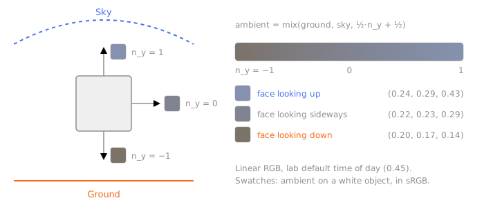
Compared with constant ambient, two things change. The shade gets a direction. The shade on a block's top, side and bottom faces each receive a different brightness and colour, so the shape reads. And the shade gets a colour. Sunlight is yellow and sky light is blue, so where the sun reaches it is warm, and where it doesn't it is cool. The warm light and cool shadows that painters often talk about come out of a single line of maths. It is not an exact calculation of bounced light, but it is close to the colours the eye expects.
Here is everything so far, captured in the lab from the same angle and placed side by side.
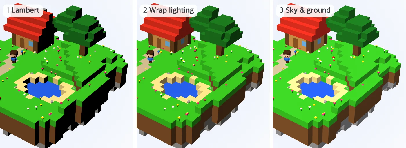
Lab steps 1–3, time of day 0.45. Rendered by me.
Measured in screen brightness, the island's average rises from 41.5 to 46 and then 51, and the brightness of its darkest 1% from 0 to 13.6 and then 18.9. These numbers were measured again at full resolution, the same way as the values shown under the lab.
Where light is blocked, it gets dark again
Hemisphere ambient has one gap of its own. It only looks at the direction of a face, so it has no idea whether the space around that face is blocked. A concave corner where two blocks meet in an L gets the same sky light as open flat ground. In reality, half the sky is hidden by blocks inside that corner, so it is a bit darker. This hiding is called ambient occlusion (AO).
In block worlds there is a classic way to compute it very cheaply: Ambient occlusion for Minecraft-like worlds, written up by Mikola Lysenko. For each of a face's four corners, you look at only the three neighbouring blocks around that corner: the two blocks on either side of it (side1, side2) and the one on the diagonal (corner).
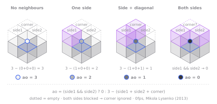
The rule is short. Each neighbour takes the brightness down one level, and if both sides are blocked it goes to the darkest level, whatever the diagonal. With both sides blocked, that corner is already shut in an inner nook, so it can't see the sky whether or not the diagonal block is there. The result is four levels, from 0 to 3.
// Taken as is from my mesh-building code (mesher.ts)
function vertexAO(side1: boolean, side2: boolean, corner: boolean): number {
  if (side1 && side2) return 0;
  return 3 - (Number(side1) + Number(side2) + Number(corner));
}
This value is baked once into a vertex attribute when the mesh is built, and the shader only reads the value interpolated across the face. Nothing has to be computed per frame. The shader divides the 0–3 value by 3, runs it through a smooth curve (smoothstep), and moves it into the range 0.3 to 1.
So the four levels become 0.30, 0.48, 0.82 and 1.00. Putting the floor at 0.3 was my choice. Set level 0 to 0 and the corners turn pitch black again. This value multiplies the sky and ground ambient in full, but is only about half mixed into the sunlight. Letting AO cut the sunlight in full would darken corners that the sun shines straight into, and I didn't think that was what AO is meant to imitate.
Vertex AO only sees gaps the size of one block. Places hidden over a wider area, like the foot of a tree or under a roof, are left to the shadows. In return, a soft darkness settles into every seam where blocks are stacked, so the blocks look joined to the ground rather than just set on top of it.
Now for the places where the sun really is blocked: shadows. The most common method in real-time rendering is the shadow map. You draw the scene once from the sun's position, writing only depth into a texture; then, when you draw the scene for real, you move each pixel into the sun's coordinates and compare it with that depth. If it is further away than the stored depth, something is in the way. The sun is very far away, so it is drawn with a parallel projection, and my renderer's shadow map is 2048×2048.
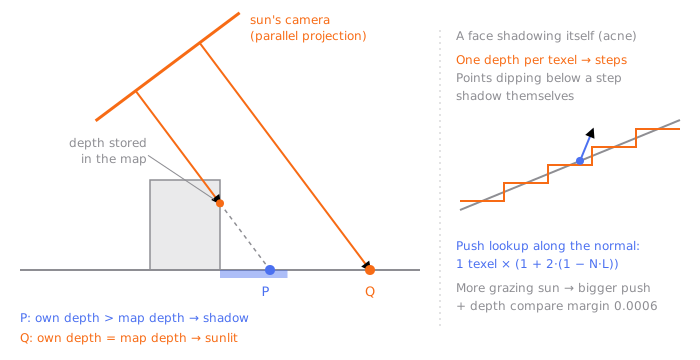
Shadow maps have a famous headache. The map stores only one depth per texel, so on a slanted face the stored depths sit like steps. Points that dip below a step are judged to be hidden by themselves, and striped shadows appear across the face (usually called shadow acne). My renderer gives the depth comparison a margin of 0.0006 and pushes the lookup position a little along the face's normal before comparing. The push distance is the world size of one shadow map texel times 1 + 2 × (1 − N·L), so faces that catch the sun at a steeper slant are pushed further.
Used as is, the shadow's edge stair-steps in the shape of the shadow map's texels. So the edge is softened with PCF (percentage-closer filtering), which averages the comparison results at several nearby spots. The result is a single value between 0 (fully hidden) and 1 (fully visible), which I'll call shadow here. This value multiplies the sunlight.
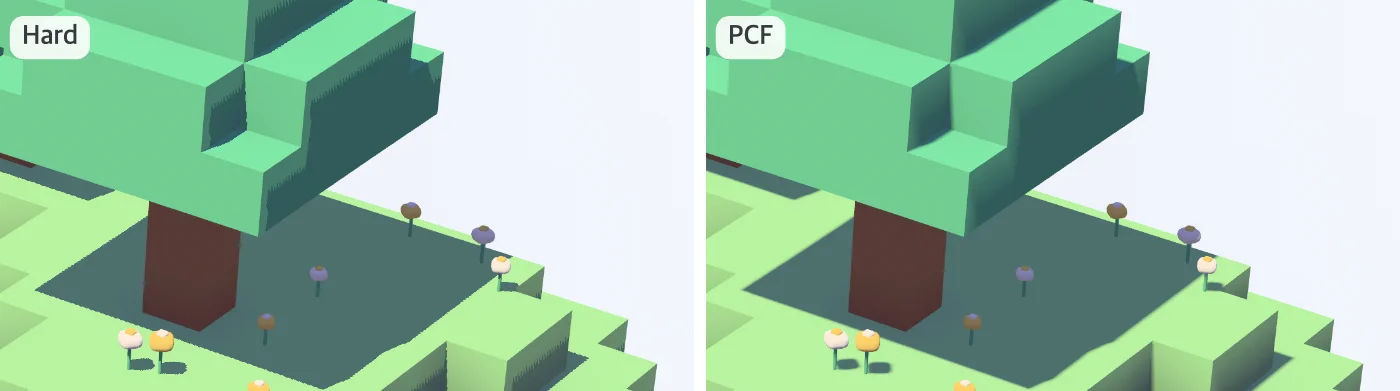
Close-ups from lab step 7 with only the shadow option changed. Hard looks up the shadow map just once. Rendered by me.
Inside a shadow, only the ambient is left now. Hemisphere ambient is on, so it isn't black, but as lab step 5 shows, in a scene with saturated base colours the shadows settle quite heavily. The island's average brightness drops from 50.4 to 47.1, and the darkest 1% from 17 to 11.9. The next two steps lift that weight.
Choosing colours that survive in the shade
So far we have been adding light. This time it is about the colours that receive that light, and how the result goes out to the screen once the maths is done. This section has more of my own judgement in it than the earlier ones.
First, the palette. In the Famitsu interview, art director Ayano says of the textures of the terrain and objects: どこかお菓子のようなおいしそうな質感や色や模様を意識して, that is, with textures, colours and patterns that look somehow tasty, like sweets, in mind. To keep sweet-like colours alive in the shade, I think it works best to pick the base colours themselves with high lightness and slightly restrained saturation. Dark colours quickly get close to black in the shade, and colours that are too saturated glow like neon where the sun hits them. In my diorama the grass is #2fa81c at the saturated step and #9cd28a at the pastel step.
Next, linear space. Lighting has to be computed on linear values and converted to sRGB just before going to the screen. Skip this and the mid-tones look much darker than they should, so the shade sinks heavily again. My renderer uses the approximation of raising base colours to the power 2.2 to move them into linear space, and raising to 1/2.2 at the end to bring them back.
Finally, tone mapping. Add sunlight and ambient together and bright faces easily go over 1. My renderer's sunlight alone has an intensity of 1.8 when the sun is high. Clip that and the highlights blow out to white, and the colour differences around them disappear. Tone mapping squeezes large values smoothly into the range 0 to 1. A common choice in games is the ACES approximation that Krzysztof Narkowicz put together.
This curve is an S. It pushes very dark values down further, lifts the middle a little, and approaches 1 slowly at the bright end. In a realistic scene that contrast gives a filmic feel.
My renderer's default is something else: a gentle curve I call 'soft'. Call the brightest of the three channels m. Below 0.6 it does nothing to m, and above that it folds it towards 1 with an exponential curve.
All three channels of the colour are multiplied by the same ratio t(m)/m, so the pastel's hue and saturation stay put and only the brightness comes down. Apply a curve to each channel separately and the brightest channel gets squeezed first, pushing the colour towards grey; this design is meant to avoid that.
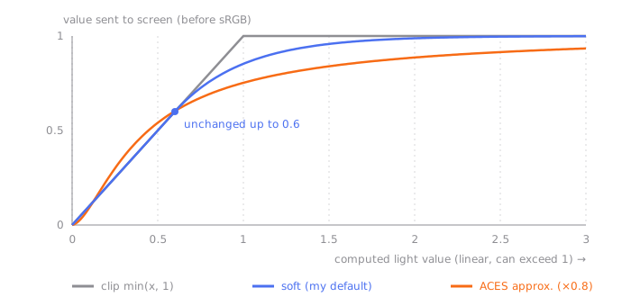
The ACES in the graph is drawn after multiplying the input by 0.8, as the shader does. In numbers, an input of 0.05 is pressed down to 0.031 by ACES and stays at 0.05 with soft. To my eye, in a pastel scene the way ACES presses down the dark end easily makes the shade muddy again, so I chose a curve that leaves the dark end alone. ACES is in the renderer as an option, but lab step 6 uses only soft. It is less about which curve is right and more a choice of which contrast you want in this scene.
Switching the palette and tone mapping together in lab step 6 makes the island's average brightness jump from 47.1 to 69.4, and the darkest 1% from 11.9 to 25.7. It is the biggest change of the seven steps.
The last step is the colour of the shadows. What actually lights the inside of a shadow is only the blue sky, so it makes sense for shadows to lean bluer than sunlit areas. Hemisphere ambient already points in that direction, but I gave it a bit more lean by hand. That is also why this step comes after the pastels. The shadow colours were picked while looking at the pastel palette, so judging them on top of saturated colours would be meaningless.
// A simplified example taken from my shader
float lit   = max(dot(n, l), 0.0) * shadow;          // Lambert × shadow
float shade = 1.0 - smoothstep(0.0, 0.4, lit);       // closer to 1 where there is almost no sunlight
vec3 tint   = mix(vec3(1.0), vec3(0.9, 0.86, 1.42), shade);
vec3 aoCol  = mix(vec3(0.5, 0.38, 0.68), vec3(1.0), ao); // instead of a grey ao
vec3 color  = albedo * ambient * aoCol * tint        // sky and ground light
            + albedo * sunColor * diffuse * shadow * mix(1.0, ao, 0.55); // sunlight
Both colours multiply only the ambient, the sky and ground light. The sunlight term is left alone. Where almost no sunlight gets in, (0.9, 0.86, 1.42) turns the ambient's red and green down a little and raises its blue by 1.42 times. So rather than getting darker, the shadow leans towards a bluish violet. (0.5, 0.38, 0.68) is for AO. Originally the corners multiplied the ambient by a grey ao (0.3 at its darkest); at this step they multiply it by a colour that gets closer to this violet the lower ao is. In the deepest corners the multiplier comes to (0.65, 0.57, 0.78), which is actually brighter than the grey 0.3, and violet.
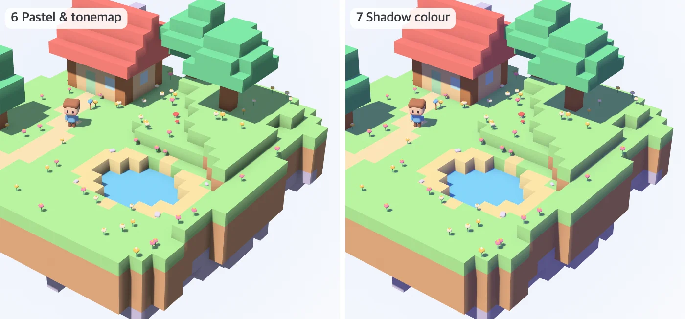
Lab steps 6 and 7. Rendered by me.
The interesting part is the numbers. Comparing steps 6 and 7, the island's average brightness goes from 69.4 to 69.1 and the darkest 1% from 25.7 to 25.3: almost unchanged. Yet 23.7% of the island's pixels change by more than 8 levels (out of 0–255) in at least one channel. This step leaves brightness alone and changes only colour. The same shadow turns teal on grass and a violet-tinged brown on earth, so the base colour survives inside the shadow instead of being wiped out.
Part of it makes physical sense, but how much to apply was decided by my eye, not by a calculation. Instead of working out exactly how much sky light there is, I picked by hand the colour that makes the shadows look most 'chill' on screen. This part is clearly art direction, and my interpretation. Make the shadow colour too strong and the whole scene looks like evening, so it was safer to keep the saturation low and adjust with lightness.
The sky colour, the ground colour and the sunlight colour all move together with the height of the sun. The lower the sun, the more the sunlight leans orange and the deeper the violet in the sky colour. Capture the diorama from the top of the post at three times of day and you can see the colour of the shade following in the opposite direction from the sunlight.
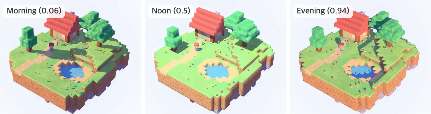
The diorama from the top of the post (with every technique in this series turned on) at times of day 0.06, 0.5 and 0.94. Rendered by me.
Turn them on and off yourself
The lab below stacks the seven steps so far in the same order. Pick a step with the step slider or the number keys 1–7, and everything up to that step is turned on. You can also press the item buttons one by one to shuffle the order. The rounded edges, materials and post-processing covered in other posts are all off, so only one thing changes per step.
Lambert only. Faces turned away from the sun have N·L below zero, so they get no sunlight, and with no other light at all they are black.
Build up the lighting of a block island one term at a time. With Lambert alone the faces turned from the sun go black; add wrap lighting, sky and ground light, vertex AO, a shadow map, a blue-violet shadow colour and a pastel palette with a tonemap, and the shade gets its colour back. Use the step slider or the term buttons, change the time of day, and look at the AO or the shadow on their own.
At step 1, the faces turned away from the sun are pitch black, because ambient is set to 0 and only Lambert is left. From step 2 you can choose the diffuse between Half Lambert and wrap, and from step 5 you can choose shadows between hard and PCF (key h). Under view, you can look at just the AO or just the shadows instead of the result (key v). The shadow view shows only the places the sunlight reaches as white, and shows faces turned away from the sun and the insides of shadows as black.
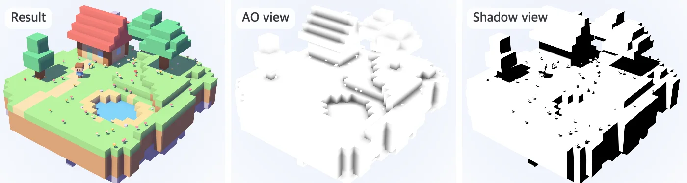
Lower the sun with the time-of-day slider and the sunlight comes in at a slant and the shadows grow longer; the more of the screen the shade takes up, the clearer it becomes how much work the earlier fixes are doing. The numbers at the bottom are the screen brightness of the darkest part of the island (the darkest 1%) and of the average. Raise the step one at a time and watch how those numbers move. Here are the seven steps, one capture each, at the default time of day and angle.
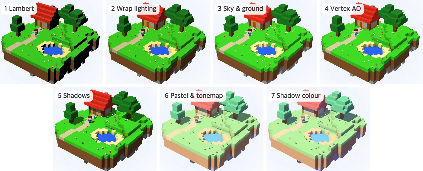
Lab steps 1–7, time of day 0.45. Rendered by me.
With light and shade sorted, next comes the surface that receives that light. In the next post, Making blocks look good enough to eat, I will try to turn the sweet-like textures art director Ayano talked about into materials.
References
Official remarks
Original sources for the techniques
- Jason Mitchell, Gary McTaggart, Chris Green, Shading in Valve's Source Engine, SIGGRAPH 2006 course Advanced Real-Time Rendering in 3D Graphics and Games, chapter 8 (PDF)
- Simon Green, Real-Time Approximations to Subsurface Scattering, GPU Gems chapter 16 (2004)
- Mikola Lysenko, Ambient occlusion for Minecraft-like worlds, 0fps (3 Jul 2013)
- Joey de Vries, Shadow Mapping, LearnOpenGL
- Krzysztof Narkowicz, ACES Filmic Tone Mapping Curve (6 Jan 2016)
This series