Contents
What this series is forWhat makes it look hardTwo ways to round the edgesBevelling the geometryTilting only the normals in a shaderComparing the twoBig-headed proportions and the cameraAfter shape and size come light and colourReferencesOfficial commentsTechnique sourcesFurther readingLet's start with the finished result. Below is the small block diorama I built for this series. It is drawn from scratch in WebGL2 with no libraries, and the terrain is made entirely of cubes of the same size. You can drag to turn it.
A small floating block island rendered with WebGL2: a cottage, a pond, three trees, flowers and one big-headed villager. Block edges are shaded round, shadows are tinted blue-violet, each block gets a candy-like pattern and a soft glaze, and the top and bottom of the frame are blurred so it reads as a tabletop miniature. Drag or use the arrow keys to turn the island.
Every block is a box with sharp corners. Yet the diorama on screen looks less like hard CG and more like a wooden toy sitting on a desk, or a soft jelly sweet. The same cube can look cold and sharp one time and make you want to pick it up the next. Where does that difference come from?
Here is the short answer. The blocks are not actually drawn sharp. Round the edges a little and those spots catch the light as thin highlight lines, and those lines make the block read as something you could touch. Add characters whose heads are big next to the blocks, and a camera that shoots narrow from far away, and the whole world reads as a small toy rather than a life-size landscape.
What this series is for
This post and the next two are one study. The starting point is Pokémon Pokopia (ぽこ あ ポケモン), released in March 2026. It is a game where you build terrain out of blocks, and its screen looks unusually cosy and soft. As an engineer, I wanted to know how that feeling is made.
One thing I should say up front. As far as I could find, there is no official technical material on this game's rendering: no CEDEC or GDC talk, no developer tech blog. What has been published is art direction comments in developer interviews and a behind-the-scenes video. So this series treats those comments as a requirements list, and records my own attempt to build a renderer from scratch that meets them. I don't use any of the game's assets or characters; everything is applied to a block diorama I made myself. I can't know what the game actually does internally, and this post makes no claim about it.
I took two comments as requirements. The first is from Game Freak director Shigeru Ohmori (大森滋), explaining why Ditto was chosen as the protagonist in the official YouTube channel's behind-the-scenes video ぽこ あ ポケモン 開発エピソード 前編 (ゲームフリーク ひみつきち #58). Below is an excerpt from around 4:22, which I transcribed from the auto-generated subtitles.
主人公をメタモンにしようと思った…もう1つの理由として、…等身をポケモンと同じような等身にしたいっていうのも実は結構大事な理由でした。こういうブロックでできた地形ですと、例えば…XYとかオメガルビー・アルファサファイアとか、そういった等身の人間であるべきだなと思っていて、変身したメタモンであればちょっとこうデフォルメした頭でっかちのフォルムにしても違和感がないだろう
He says that wanting the protagonist's head-to-body ratio to match the Pokémon was actually a fairly important reason. With terrain made of blocks like this, he thought a human protagonist would need the proportions of X and Y or Omega Ruby and Alpha Sapphire, whereas a transformed Ditto could have a stylised, big-headed shape without looking out of place. What I found interesting is that he thought of the block terrain and the character proportions as a pair.
The second is from Koei Tecmo art director Marina Ayano (綾野万里奈), in a Famitsu interview.
造形や表現を大きくデフォルメしているからこそ、地形やオブジェクトの質感に関しては、現実とリンクする素材感を軸にしつつ…
Because the shapes and expression are heavily stylised, she says, the textures of the terrain and objects were built around a sense of material that links to the real world.
As I read them, these two comments translate into renderer terms like this. Keep the shapes simple, but have them catch light like real objects. And make the size of the world read like a toy. This post covers shape and size; light and texture come in the next two.
What makes it look hard
First the blocks have to get onto the screen. The diorama is a 3D grid, and each cell either holds a block or doesn't. The most naive approach is to draw one cube, six faces, per block.
But when two blocks touch, the two faces between them can't be seen from any direction. So we go through the faces one by one and only create a face when the neighbouring cell it faces is empty. This is the culling approach described in Mikola Lysenko's Meshing in a Minecraft Game. For two blocks it only takes you from 12 faces to 10, but for a solid 4×4×4 lump the difference gets large. Drawn separately, the 64 blocks have 384 faces, while only 96 are visible on the outside, 16 per side.
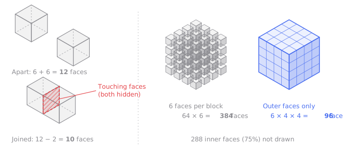
The more blocks there are, the more the inside fills up and only the outside remains, so the bigger the terrain, the wider this gap gets. The diorama above would be 21,498 faces drawn separately, but only about 12% are exposed. The loop that picks faces looks roughly like this. It is a simplified example for explanation.
// Simplified example for explanation
const DIRS = [
  [1, 0, 0], [-1, 0, 0],
  [0, 1, 0], [0, -1, 0],
  [0, 0, 1], [0, 0, -1],
] as const;

for (let z = 0; z < size; z++)
  for (let y = 0; y < size; y++)
    for (let x = 0; x < size; x++) {
      if (!solid(x, y, z)) continue;
      DIRS.forEach(([dx, dy, dz], face) => {
        if (solid(x + dx, y + dy, z + dz)) return; // a neighbour blocks it, so the face is hidden
        pushFace(x, y, z, face);                   // 4 vertices, 6 indices
      });
    }
All the faces go into a single buffer. Instead of issuing a draw command per block, the terrain and all the small props are drawn in one draw call.
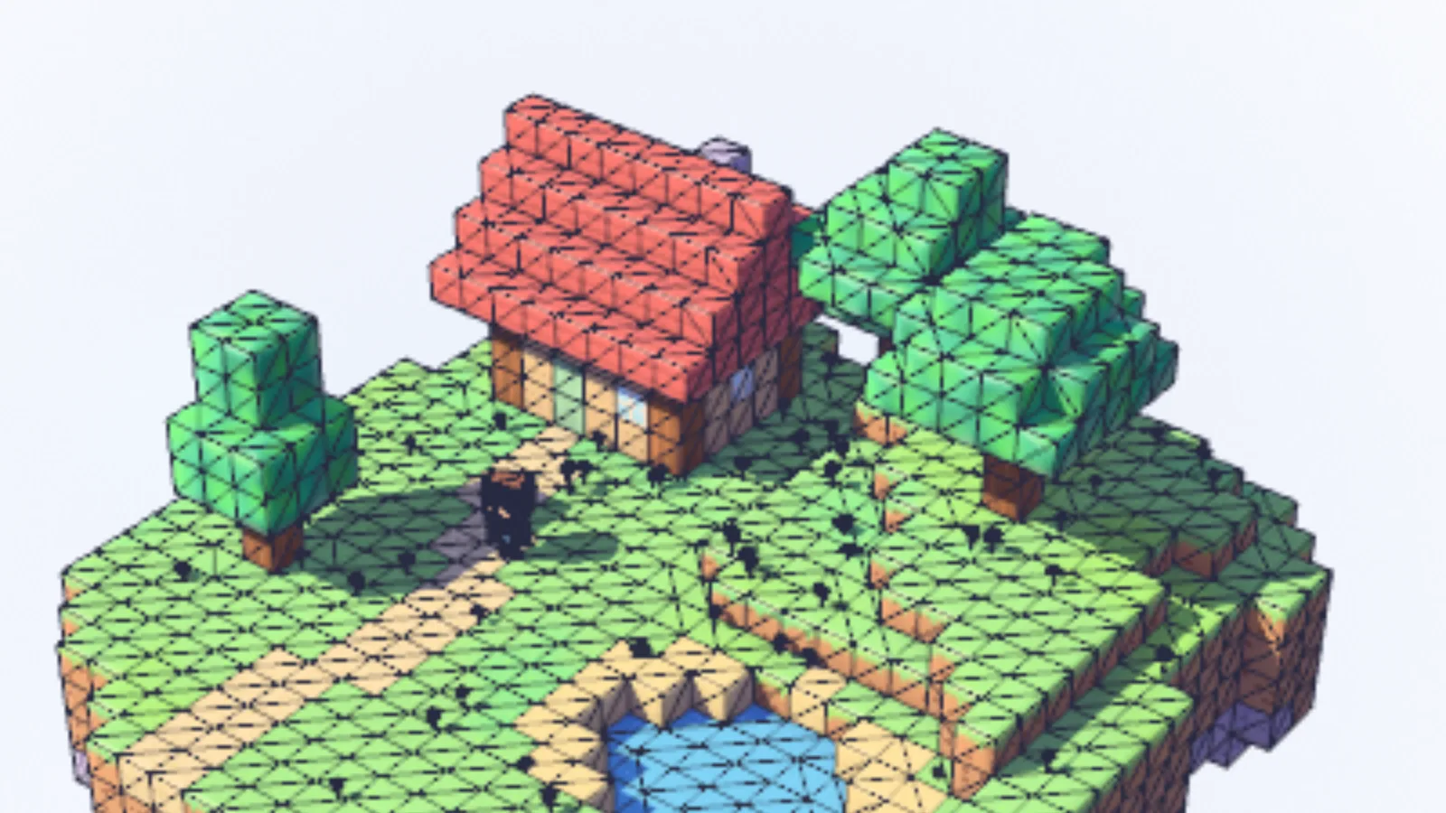
The diorama above with triangle edges overlaid. Each face is two triangles. Rendered by me.
For a diorama of this size, that is enough. There are further steps, such as greedy meshing, which merges neighbouring faces of the same colour into one large rectangle, but I don't use it in this post.
Shine light on blocks drawn this way and the problem is obvious straight away. Nothing is wrong, but it looks hard. It looks like the cube from the first chapter of a computer graphics textbook.
The cause is the normals at the edges. As we saw in the previous post, shaders use the normal to decide brightness. On a perfect cube, the whole top face points up and the whole side face points sideways, and at the edge the normal jumps 90 degrees at once. None of the directions in between exist anywhere on the surface. So the top face is painted one brightness, the side face another, and the edge is just the line where the two meet.
Real objects aren't like that. Wooden blocks, plastic toys, sweets: almost anything you hold in your hand has a small radius on its edges. Inside that narrow band is every direction from the top face's to the side face's. So wherever the light and the eye are, somewhere in the band there is a direction that sends the light straight back to the eye. That spot shines as a thin highlight line.
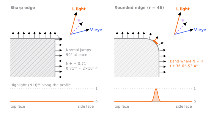
As far as I can tell, the human eye trusts this line quite a lot. With a highlight on the edge, we read the thing as an object we could touch; without one, as a shape on a screen. So the first step to making blocks look soft is to round the edges a little and get this line back.
Two ways to round the edges
There are broadly two ways. Actually change the shape, or leave the shape alone and change only the normals.
Bevelling the geometry
The first is to cut into the mesh itself. Like the bevel in a 3D tool, it turns each edge into a rounded band. The result is honest. Even the silhouette becomes round, and from any angle it is a genuinely rounded edge.
The price is more vertices. A cube has 6 faces and 24 vertices (each face has a different normal, so the faces can't share corners: 4 each). Turn the edges into rounded bands and each of the 12 edges becomes a band split into several steps, and at each of the 8 corners a small piece of sphere appears where three bands meet. Split each band into n steps, and the band vertices grow in proportion to n while the sphere-piece vertices grow roughly with n squared. The smoother the rounding, the heavier each block gets.
My implementation fixes the band at 3 steps. So making the radius bigger or smaller only changes the shape, not the vertex count. Even so, the difference is large. The scene in the lab below has 304 vertices with square blocks; turn the bevel on and it becomes 1,078 vertices.
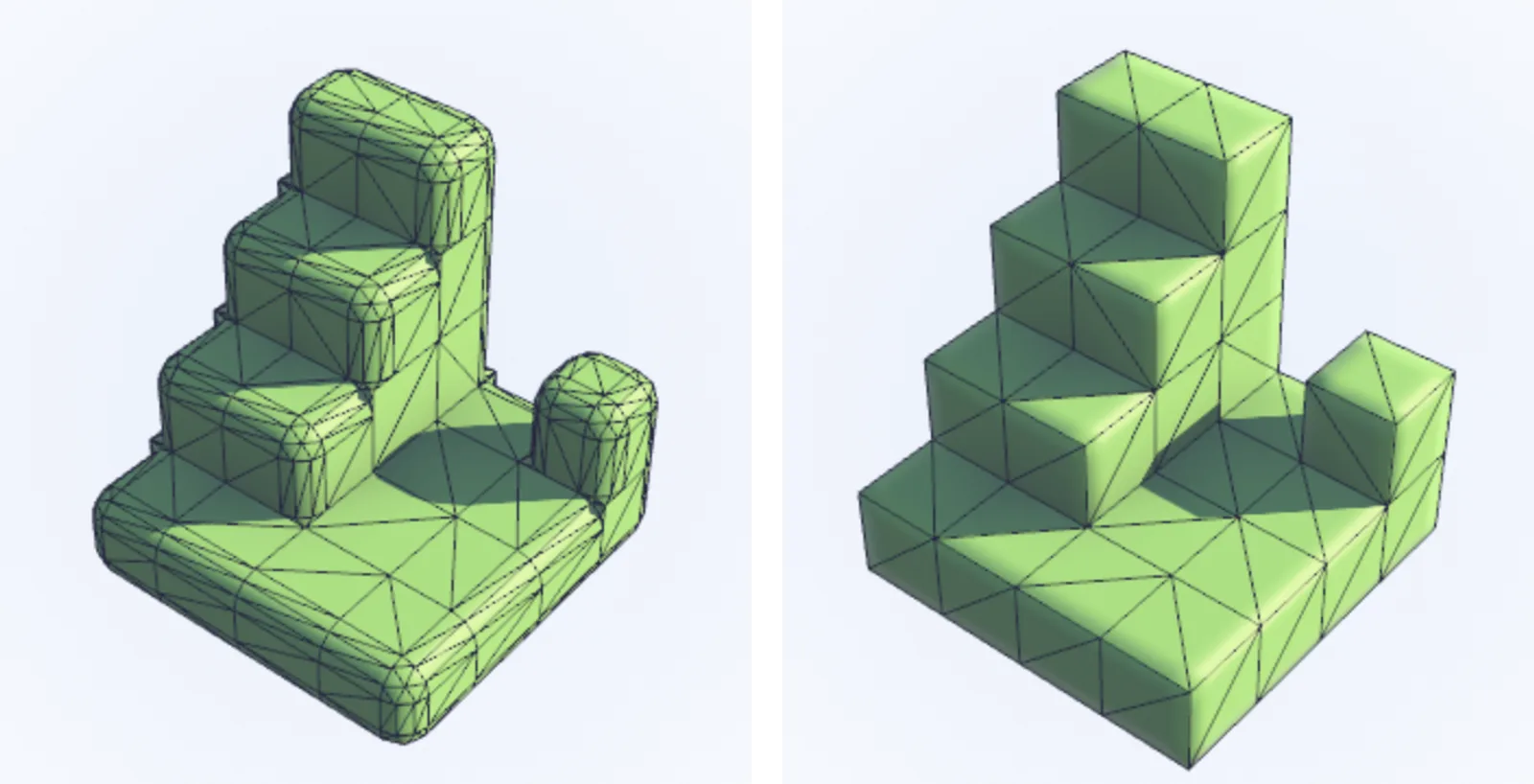
Left, geometry bevel (1,078 vertices); right, shader rounding (304 vertices). The wireframe view of the lab below. Rendered by me.
On top of that, problems appear between blocks that touch. Bevel each block on its own and even a wide flat area like the floor gets a groove at every block boundary, turning it into a tiled floor. So my bevel only cuts convex edges, where both meeting faces are exposed. Even then the ends aren't clean. Where a rounded band runs into a square neighbour, such as the wall of a step, a small gap opens, and I had to plug it with a separate fan-shaped cap. In the end the shape of a block changes with every arrangement of its neighbours, and the meshing code becomes several times as long as plain culling.
Tilting only the normals in a shader
The second is to leave the mesh as plain cubes and tilt only the normals near the edges in the fragment shader. Each face still has 4 vertices.
The position within a face comes from the face's own UVs. One edge of the face is 0 and the opposite edge is 1, so the distance from a pixel to each of the four edges comes out directly in block units. Once you are inside radius r from an edge, tilt the normal towards that edge. Make it exactly 45 degrees at the edge, and the two meeting faces end up with the same normal at the edge, so the brightness carries over as it would on a rounded edge. This diorama sets r to 0.3. That is 30% of a block's side, a fairly wide band. For leaf blocks I raised r to 0.5 so they look like pillows.
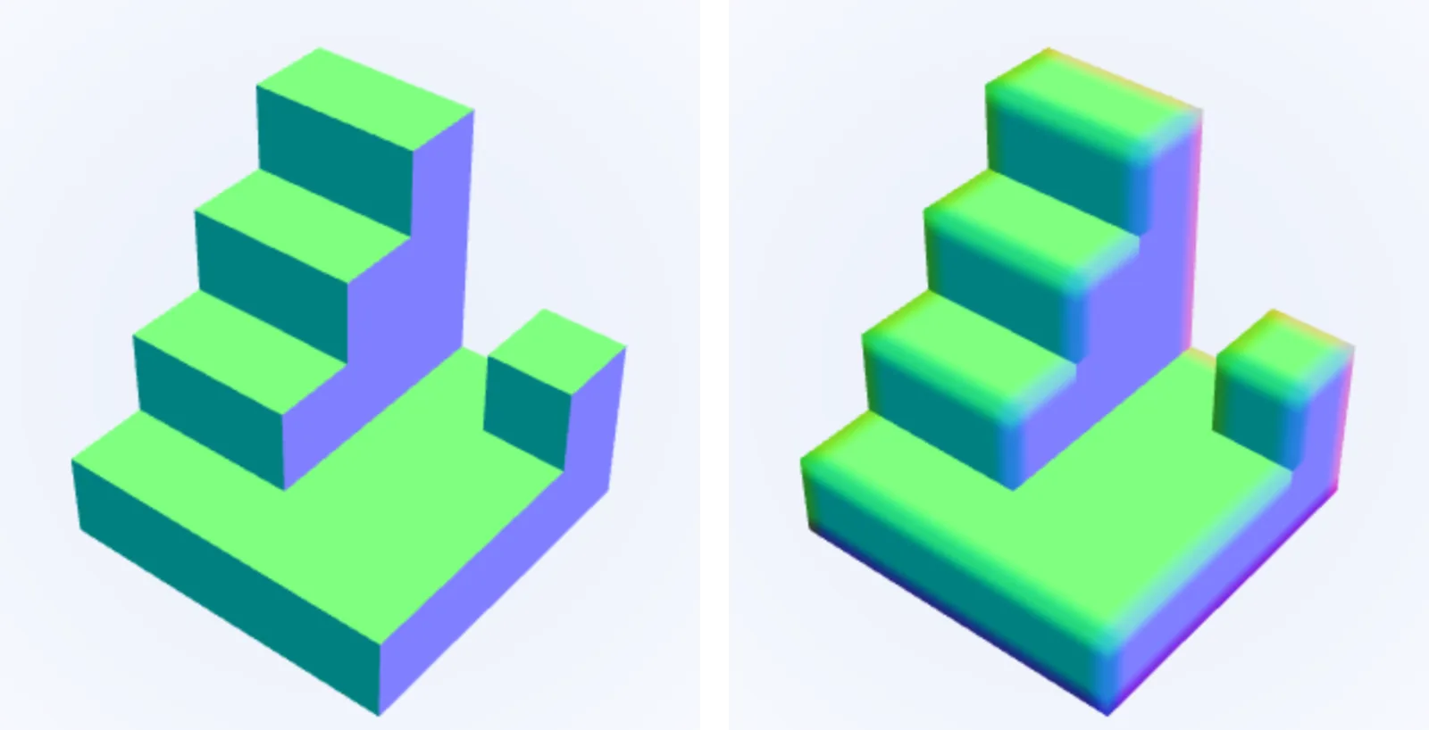
Normal view. Left, no rounding; right, shader rounding (radius 0.3). Both use the same mesh. Rendered by me.
One more thing is needed here. Round all four edges of every face and, as with the bevel earlier, the whole floor becomes tiles. Some block boundaries aren't real edges but places where the same plane continues. So when creating a face, for each of its four edges I check whether there is a block in the cell beyond, and store the result as a 4-bit mask in the vertex data. If there is a block in that cell, the surface either carries on flat or folds inward, so edges whose bit is set are not rounded. Only convex edges with the bit clear get rounded. This is why I didn't use greedy meshing earlier. Merging faces loses the per-block UVs and the edge information.
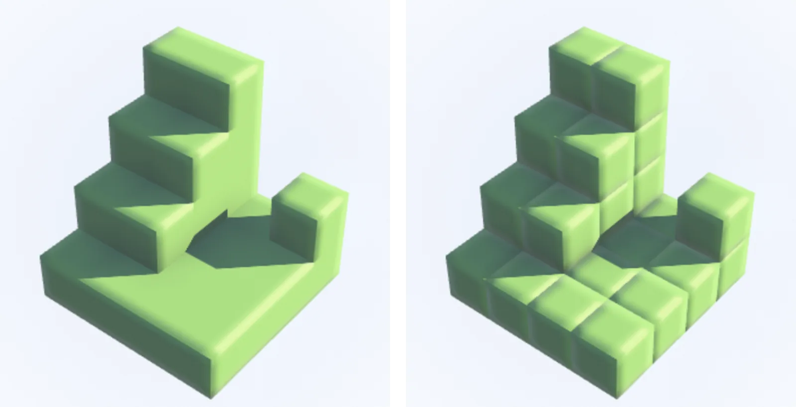
Shader rounding. Left, neighbour mask on; right, off. Rendered by me.
The shader side looks like this. It is a simplified example for explanation.
// Simplified example for explanation
in vec2 vUV;           // position within the face, 0..1 (one block cell = 1)
flat in int vMask;     // 1: -u, 2: +u, 4: -v, 8: +v cell holds a block -> don't round that edge
uniform float uRadius; // width of the rounded band, in block units. 0.3 in this diorama

// How much to tilt the normal at distance d from the edge. 0 degrees where the band starts (d = r), 45 at the edge (d = 0).
// Ease the angle with smoothstep and convert it with tan, so adding it to N below tilts it by exactly that angle.
float bend(float d) {
  float s = clamp(1.0 - d / uRadius, 0.0, 1.0);
  return tan(0.7854 * s * s * (3.0 - 2.0 * s)); // 0.7854 = π/4
}

vec3 roundedNormal(vec3 N, vec3 T) {
  vec3 B = cross(N, T);
  vec3 off = vec3(0.0);
  if ((vMask & 1) == 0) off -= T * bend(vUV.x);
  if ((vMask & 2) == 0) off += T * bend(1.0 - vUV.x);
  if ((vMask & 4) == 0) off -= B * bend(vUV.y);
  if ((vMask & 8) == 0) off += B * bend(1.0 - vUV.y);
  return normalize(N + off);
}
T and B are the directions in which the face's UVs increase. They are the same as the tangent space from the previous post, and on a cube's faces they are just the axis directions, so there is nothing to compute. Near a corner, the tilts from both directions add up and the normal leans diagonally.
Not following a true circular arc is my choice. If the tilt follows the arc exactly, the normal starts bending abruptly where the band begins, and that boundary tends to show up as a line. Easing the angle in makes the start of the band blend in unnoticed, and towards the edge, directions close to 45 degrees take up a wider strip, so the band catching the sunlight is visible even from far away. I chose the version where the highlight shows well over the one that imitates the shape exactly.
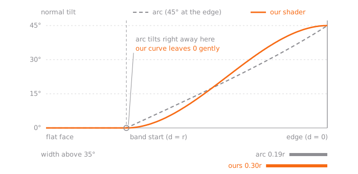
The graph plots the shader's formula exactly. The arc it is compared with is the cross-section of a truly rounded edge, fitted to reach 45 degrees at the edge.
Comparing the two
The two methods are good at different things. The shader approach adds no vertices, needs no mesh rebuild when the radius changes, and with the neighbour mask it handles continuing planes cleanly. The silhouette, though, is still a square box. Where a block's outline stands against the sky, you can see the lie up close. Only the normals were tilted and the shape is unchanged, so shadows fall square too.
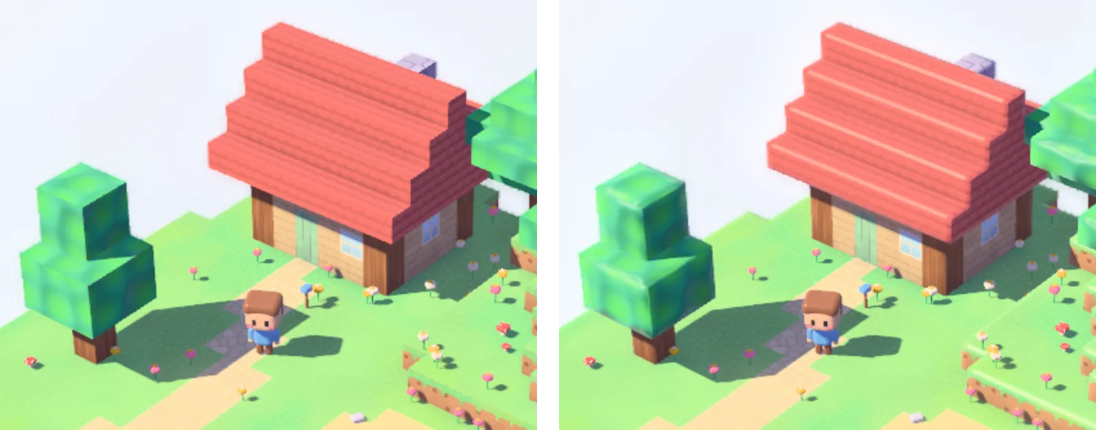
Same scene, same light. Left, no rounding; right, shader rounding (radius 0.3). Rendered by me.
The bevel is honest down to the silhouette and the shadows, but it adds vertices, and changing the shape by neighbour makes the meshing complicated. As I see it, in a diorama where blocks look small, the edge highlight shapes the impression far more than square corners in the silhouette do. In the two shots above, too, what changed is not the outline but the bright line running along the edges. So the renderer in this series uses the shader approach by default.
You can compare the two methods yourself in the lab below. The scene is a three-step staircase and one separate block on a 4×4 grass plate. It has convex edges, an inward fold at the foot of the steps, and seams where the same plane continues. Switch Method between none, geometry bevel and shader, and use the radius slider to set the band width anywhere from 0.04 to 0.4. Change View to normals to see normal directions as colours, or pick wireframe to overlay the triangles on the result and see how many vertices the bevel adds. The vertex and triangle counts appear at the bottom of the view. The neighbour mask can only be changed with the shader method; turn it off and even flat areas like the floor and the stair treads get a line at every block boundary and split like tiles.
A close-up of a grass block staircase and one loose block. Leave the edges square, cut them for real with extra vertices (geometry bevel), or tilt only the normals near each edge in the fragment shader (shader rounding). Switch to the normal or wireframe view to see where the two differ, and read the vertex and triangle counts to see what each one costs.
Big-headed proportions and the camera
With rounded edges, each block looks like an object. But how big that object is, whether a boulder the size of a house or a toy the size of your palm, is still undecided. What follows in this section is my own reading of Ohmori's comment above as a question of size.
In a block world, the block is the world's unit. All the terrain is made of boxes of the same size, so the only way to tell how big a box is is the character standing next to it. If a realistically proportioned person stands a few blocks tall, the blocks read as large, like real building materials, and the square terrain becomes a rough, chunky landscape. If instead a short character with a big head stands one or two blocks tall, the blocks read as toys that character might play with. When Ohmori said a stylised, big-headed shape suits block terrain, I took it to mean matching sizes like this. The villager in this diorama was made with the same idea. It isn't any particular character, just a plain figure I made, about two blocks tall with nearly half of that being head.
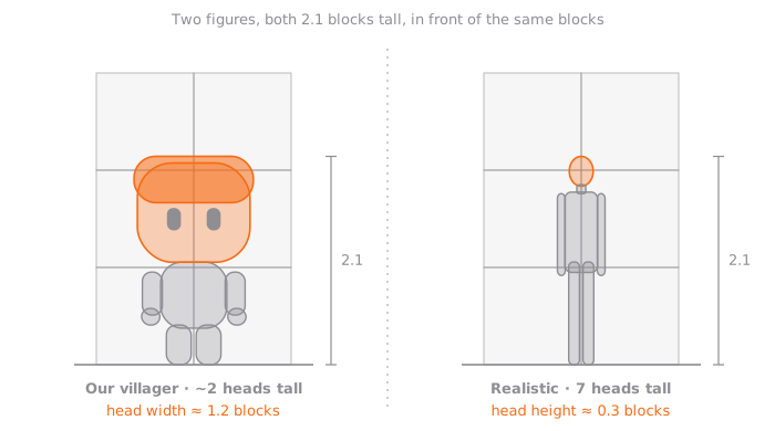
Even at exactly the same height, one makes the blocks look big and the other small. People seem to use the head as a ruler when judging size. A block the size of a head is a toy in your hand; a block the size of three heads is building material. The figure on the right is a generic seven-heads-tall diagram drawn for comparison.
The second thing that sets size is the camera. Shoot close with a wide field of view and the camera seems to be standing inside the scene, so the diorama becomes a landscape you could walk into. Shoot from far away with a narrow field of view and the perspective weakens, giving a picture of an object on a table seen from a step back. The block grid also stays straight right to the edges of the screen.
A quick calculation shows the difference. Say we shoot a diorama of width W head-on, so that its front edge exactly fills the width of the screen. At a 60-degree field of view the camera needs to be 0.87W from the front edge; at 22 degrees it has to back off to 2.57W. Put identical blocks at the front and back of the diorama, and their size on screen is inversely proportional to their distance from the camera. At 60 degrees the front block looks 1.69 times the size of the back one; at 22 degrees the gap shrinks to 1.26 times.
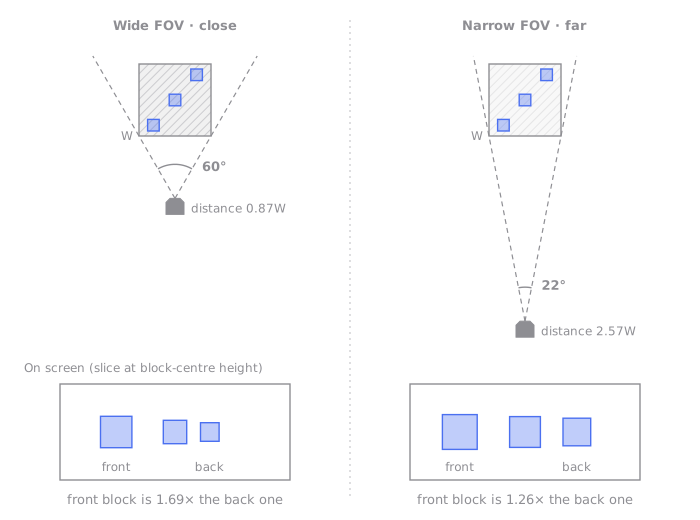
Here is the same thing in the actual renderer. I shot the diorama above from the same direction at 60 and 22 degrees, adjusting only the distance so the island just fills the screen.
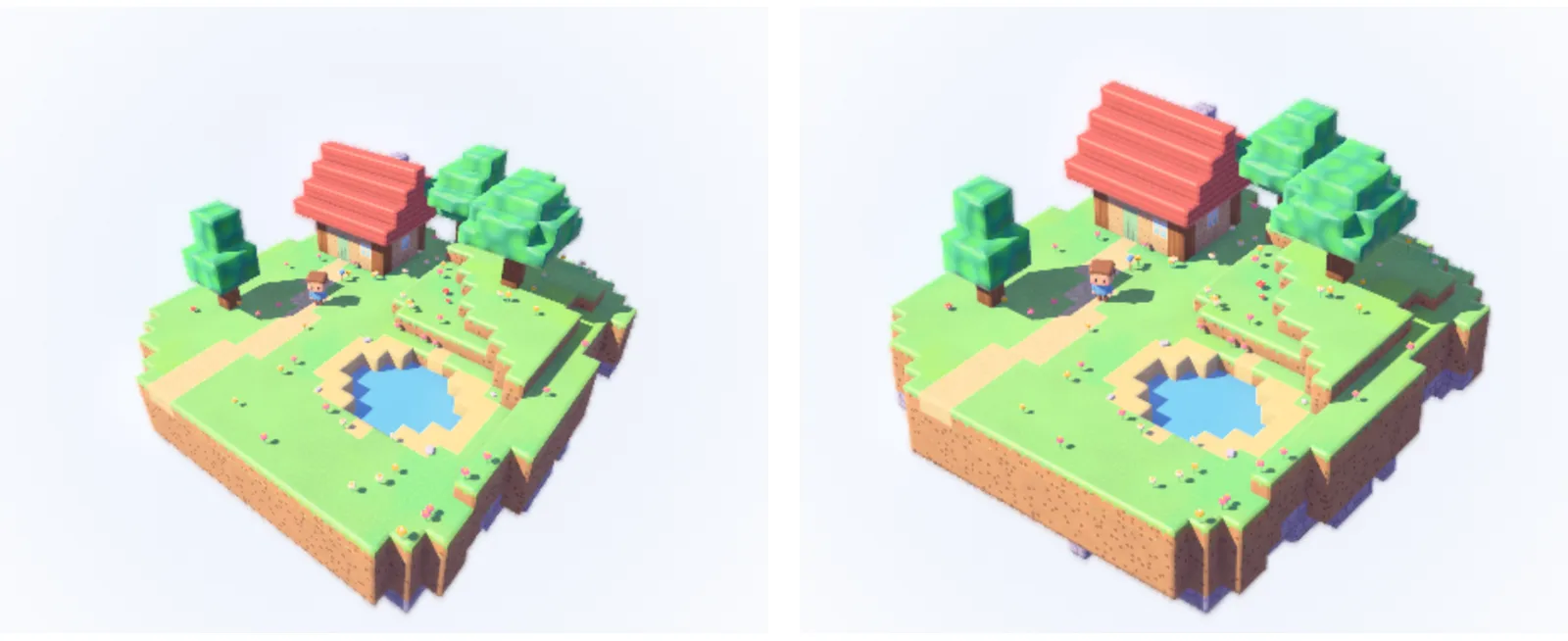
The same island. Left, 60-degree field of view; right, 22 degrees. Rendered by me.
This diorama uses a 24-degree vertical field of view. That is just a value I picked while turning the diorama around, not the game's actual camera setting. Go narrower and it becomes nearly orthographic and loses depth; go wider and the front blocks grow until it starts to look like a life-size landscape.
After shape and size come light and colour
Making square blocks look soft took two things: shape and size. Shape and size don't explain all of the cosiness. The shade in the diorama above isn't black; it has a blue-violet tint. The next post, Why game shadows aren't black, covers that light and colour.
References
Official comments
- Game Freak official channel, ぽこ あ ポケモン 開発エピソード 前編 (ゲームフリーク ひみつきち #58) (2026.8.7), from 4:22, on why Ditto became the protagonist
- Game Freak official channel, ぽこ あ ポケモン 開発エピソード 後編 (ゲームフリーク ひみつきち #59) (2026.8.14)
- Pokémon Pokopia developer interview (2026.2.16), Famitsu
- Pokémon Pokopia interview (2026.2.11), Geek Culture
Technique sources
- Meshing in a Minecraft Game (2012), Mikola Lysenko, 0 FPS
Further reading
- CEDEC 2023 パルデア地方を描き出す――見た目の仕組みを徹底解説!, Game Freak
- CEDEC 2026 すべてが壊せる世界の構築 ~破壊を実現するボクセル技術~, Donkey Kong Bananza
- CEDEC 2026 もっと壊したくなる世界 ~驚きデストラクションと濃厚な絵作り~, Donkey Kong Bananza
- CEDEC 2022 KATANA ENGINE session, Koei Tecmo